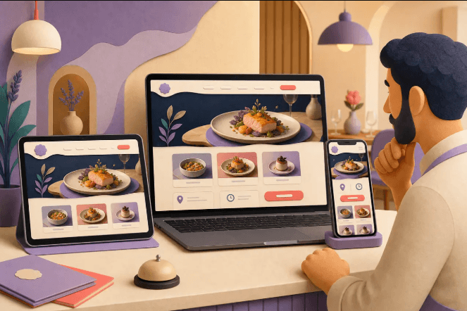
A restaurant is judged on more than the food. Guests notice the lighting, the seating and the sound of the room before the first plate arrives, and many form an opinion on the website before they book. When the two feel connected, the whole experience becomes more memorable.
Why the fitout and website should match
Your fitout and your website tell the same story in different places. If the room feels relaxed and warm but the site looks cold and corporate, guests sense a disconnect. Matching the two helps new visitors know what to expect and helps regulars feel at home.
Consistency also saves money. When your colours, materials and tone are decided once, they can be applied to menus, signs, social media and the website. That avoids expensive redesigns later and gives your brand a confident, finished look from the very first day.
Defining your restaurant’s personality
Before choosing finishes or fonts, describe your restaurant in a handful of words. Is it lively, intimate, family friendly or refined? Think about who you want at your tables and what they should feel when they walk in. Those words will guide every later decision.
Look at your menu and service style as well. A casual share plate venue needs a different atmosphere from a quiet degustation room. Be honest about what you can deliver every night, because a personality that is too ambitious will feel forced and costs more to maintain.
Planning the layout and flow
A good layout lets staff move easily, keeps queues from forming and gives guests a sense of comfort. Think about the path from the front door to the table, from the kitchen to the pass and from the bar to the dining room. It pays to see how local specialists approach restaurant fitout Nowra before you finalise your plan.
Seating deserves careful thought. Mix tables for couples, groups and solo diners, and leave enough space between them for conversation. Crowded rooms may look busy, but guests tend to leave sooner and remember the noise rather than the meal, which affects repeat bookings.
Do not forget the practical areas. Storage, bathrooms, waiting spaces and accessible entries all shape the guest experience. Plan for these early, because changing them once walls are built is costly. Check requirements with your local council and your certifier so the design is compliant from the beginning.
Lighting, materials and mood
Lighting is one of the strongest tools in a restaurant. Warm, layered lighting flatters food and faces, while harsh overhead light can make a room feel like an office. Use dimmers where you can, so the mood can shift from lunch to dinner without any expensive changes.
Materials affect both look and sound. Hard floors and bare walls create echo, while timber, fabric and soft finishes absorb noise. Choose surfaces that are easy to clean and durable under heavy use, since a beautiful finish that stains quickly will soon look tired.
Translating the room into colours online
Take colours and textures from the room and carry them into the website. If you have used terracotta, deep green or natural oak, echo those tones in headings, buttons and backgrounds. A small, consistent palette feels deliberate and calm, and it keeps the page easy on the eye.
Choose fonts that match your style. A rustic bistro may suit a warm serif, while a modern bar might prefer clean sans serif lettering. Whatever you pick, make sure the text is readable on a phone, because most guests will check your hours and menu while they are out.
Finding website inspiration
Looking at other sites is the fastest way to learn what works. Browse examples of layouts, photography and menu pages, and note what makes you want to book. A curated gallery of Australian website designs can show how businesses of all kinds present themselves, and you may spot ideas you would not have considered.
Collect a few favourites and write down why each appeals to you. Perhaps the photos are generous, the navigation is simple or the booking button is easy to find. Share your notes with your designer so they understand your taste without needing long explanations.
Avoid copying another venue too closely. Use inspiration to understand principles, such as hierarchy, spacing and tone, then apply them to your own story. A site that looks like a clone of a competitor will not help guests remember you.
See also: How Strategic Protection Ensures Growth and Stability in Fitness Businesses
Menus and bookings online
Guests want to see your menu before they decide, so put it in the text of the page rather than in a hard to read image or a large download. Update it whenever dishes change, and note any common dietary options. Clear information helps people choose with confidence.
Make booking simple. Place a visible button at the top of the page and again near the bottom, and keep the form short. Show your opening hours, address and parking advice in plain text, so guests do not have to hunt through several pages to plan their visit.
Photography that sells the experience
Good photography shows the room, the food and the people. Plan a shoot after the fitout is complete but before opening night, when the space is clean and the lighting is set. A professional photographer can capture the atmosphere you worked so hard to create.
Include a mix of wide room shots, close dish photos and candid moments of staff at work. Avoid heavy filters, because guests will feel misled if the real plate looks different. Honest, appealing images set accurate expectations and encourage visitors to book.
Launching both at the same time
Try to time your website launch with the reopening of the space. Publish a simple page early with a message that you are coming soon, and collect email addresses from interested locals. That list gives you an audience ready to book on day one.
After opening, check what guests say. Read reviews, ask staff for feedback and watch how people use the site. Small adjustments to layout, wording or menu displays can follow quickly, and the fitout and website will keep working together as your restaurant grows.
A restaurant that looks, sounds and reads as one consistent idea is easier for guests to remember and recommend. Keep notes as you plan, share them with your designer and builder, and check regularly that the details still match. The effort will show in the atmosphere you create.